monet
Recycling Mobile App
Recycling is incredibly difficult.
It is not always clear whether an item is recyclable or not and this lack of clarity has led to an apathetic attitude towards recycling. Additionally, people tend to have a hard time caring about or feeling motivated to recycle because they cannot see or feel the impact of their individual efforts. However, Americans generate over 35 million tons of plastic waste per year and yet only 8.4% of that waste is recycled.
The detrimental environmental impact of this un-recycled waste cannot be ignored.
The Solution
The monet app helps people check whether an item is recyclable or not, track items they have recycled, measure the impact of their recycling habits, and build a community of fellow recyclers.
My Role
I was the UI/UX designer responsible for the entire process including:
Secondary and user research
Sketching, wireframing, and creating high fidelity prototypes
Conducting usability tests
Developing final mockups
Design Process
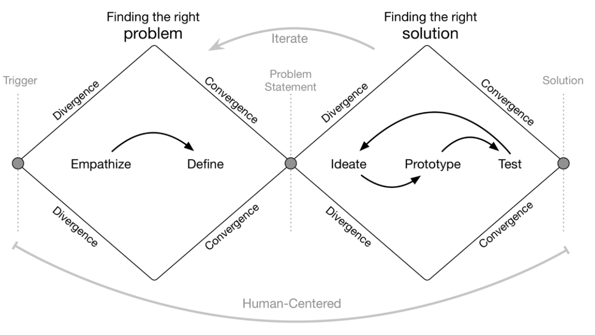
My design process followed the design thinking methodologies with the Human-Centered Design approach throughout the whole process.
Empathize
I conducted secondary research in order to develop a comprehensive understanding of the problems surrounding recycling. There was an abundant amount of resources from the private sector, non-profit organizations, and government organizations detailing the data on recycling in the United States. Here are some statistics I found particularly interesting:
62% of Americans worry that a lack of knowledge is causing them to recycle incorrectly
Only 34% of Americans recycle paper or cans even though 70% are concerned about climate change
Americans only recycle approximately 32% of its total waste
Upon getting a better understanding of the statistics, I wanted to interview real people to dig deeper into the struggles and frustrations people face when it comes to recycling more.
I created a screener questionnaire to ensure that I was speaking with people who believe in climate change (indicating that they have a reason to care about recycling) and those who in fact struggle to recycle more and/or properly. I recruited 5 participants through email and social media to conduct 30-minute interviews.
Here are some specific questions I asked in my interview
How often do you recycle?
How do you feel about your recycling habits?
How do you figure out how to properly dispose of certain items?
How often do you think about your impact on the environment?
2. Define
Once I completed the 5 interviews, it was time to summarize the interviews and synthesize insights to get a clear sense of the evidence that would influence my design.
Affinity Map
I created an affinity map by writing down key quotes and takeaways from the interview on sticky notes. As I organized the notes on my wall, a pattern quickly became apparent. Unsurprisingly, the lack of time to sort their garbage and lack of awareness/knowledge regarding recycling were major obstacles for people. However, I was surprised by the major role that shame and guilt played in fostering an apathetic attitude towards recycling.
Quick and simple affinity map using sticky notes and my wall
Empathy Map
Then, I organized the insights from the interviews into empathy maps in order to gain a deeper understanding into the particular types of users.
Persona
I came up with two personas based on my insights from my interviews and the subsequent empathy maps that I created. These personas helped ensure that my design decisions were relevant to the type of users who would be most likely to use the app.
Affectionate Audrey
Audrey understands that it is important to recycle, but she feels too overwhelmed by everything going on in her life to learn how to recycle properly. Additionally, she is not sure what kind of impact changing her recycling habits will have and thinks there may be other ways to make a bigger contribution.
“I want to be greener for my children...but I don’t know how.”
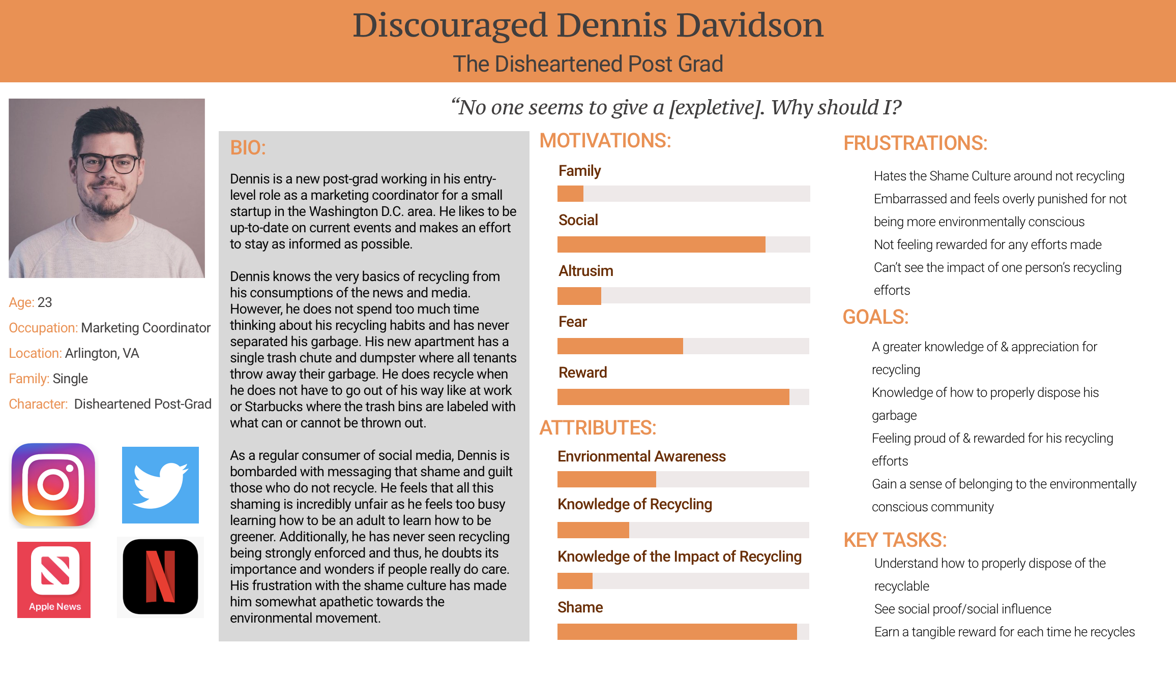
Discouraged Dennis
Dennis knows the very basics of recycling from his consumption of news and media. However, he does not spend too much time thinking about his recycling habits and has never separated his garbage. As a regular consumer of social media, Dennis is bombarded with messaging that shame and guilt those who do not recycle. He feels that all this shaming is incredibly unfair as he feels too busy learning how to be an adult to learn how to be greener. Additionally, he has doubts regarding the importance of recycling and his frustrations with the shame culture has made him apathetic towards recycling.
“No one gives a [expletive]. Why should I?”
How Might We…
The process of identifying personas helped bring to light the problems I needed to solve through my designs. These problems are:
How might we help people make sense of what is or is not recyclable?
How might we demystify the effects and impact of recycling for people?
How might we help people feel rewarded when they recycle?
How might we help people feel less alone in their efforts to be greener?
3. Ideate
User Stories
Once I understood what problems I wanted to solve, I created a list of user stories to identify the functional needs of my product.
I organized my user stories by priority level with Level 1 being functionalities I wanted to address in my Minimum Viable Product (MVP).
Early Ideation
After identifying the functional needs of my product, I created rough drawings to sketch out my initial ideas for how to solve the problems highlighted in my user stories.
Highlight from my early ideations
4. Prototype
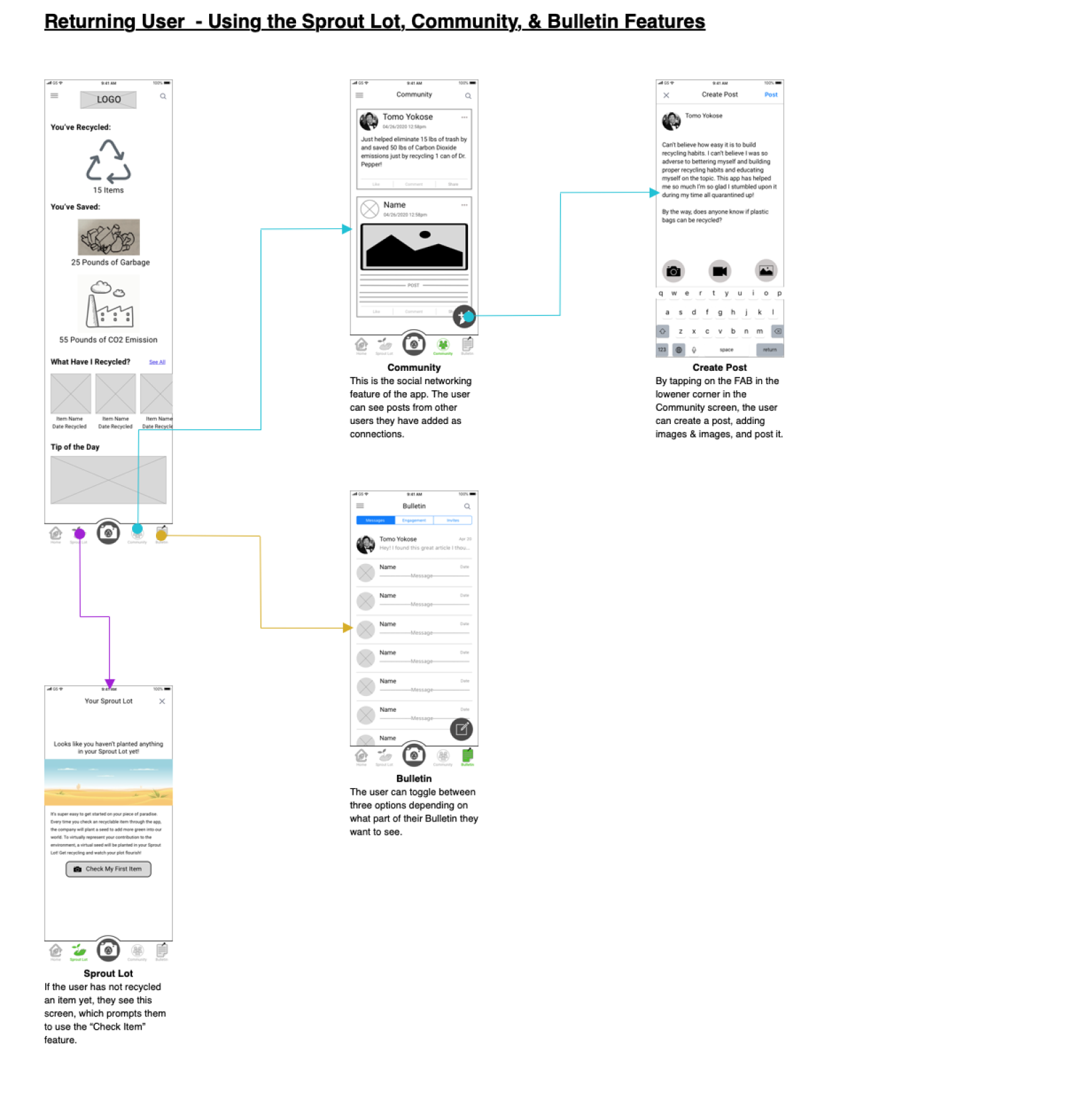
User Flows
Reflecting upon the user stories and early ideations that I created, I was able to identify several red routes that would help solve the overlapping problems for my two personas. I created the user flows for these red routes:
Sketches
Once I created the user flows and understood the specific routes that a user would take in my app to achieve certain goals and outcomes, I used pen and paper to sketch out key screens in order to conduct a series of guerrilla usability tests.
Sketches used in guerrilla usability testing
Guerrilla Usability Testing
I conducted a guerrilla usability test with 6 remote participants over the span of a week using my sketches and the POP by Marvel program. The participants were not screened in or out. I did not go into the testing with a specific hypothesis in mind, but my goal was to test if the functionality of the app was easy to understand. Additionally, I wanted to know if the various features of the app could be understood from quickly interacting with the app and particularly test the terminology and iconography.
Overall, this method of testing was certainly useful for driving my design in the right direction. While the primary purpose of my app was easy to understand, the testing shed light on improvements that can be made to the navigation and the terminology used in the app.
Wireframe & Wire Flows
Taking the insights I gained from my guerrilla usability testing, I made changes to my initial sketches and turned them into low-fidelity wireframes.
Visual Design
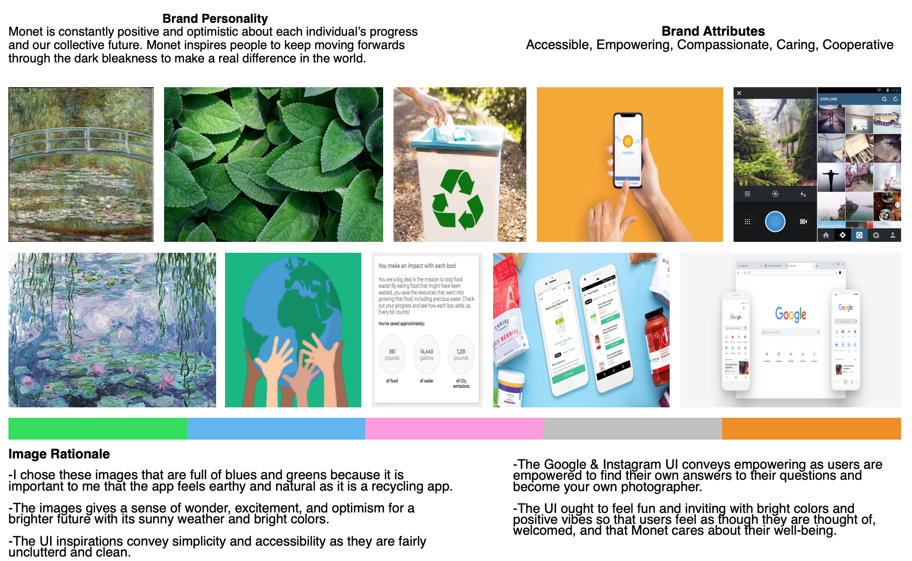
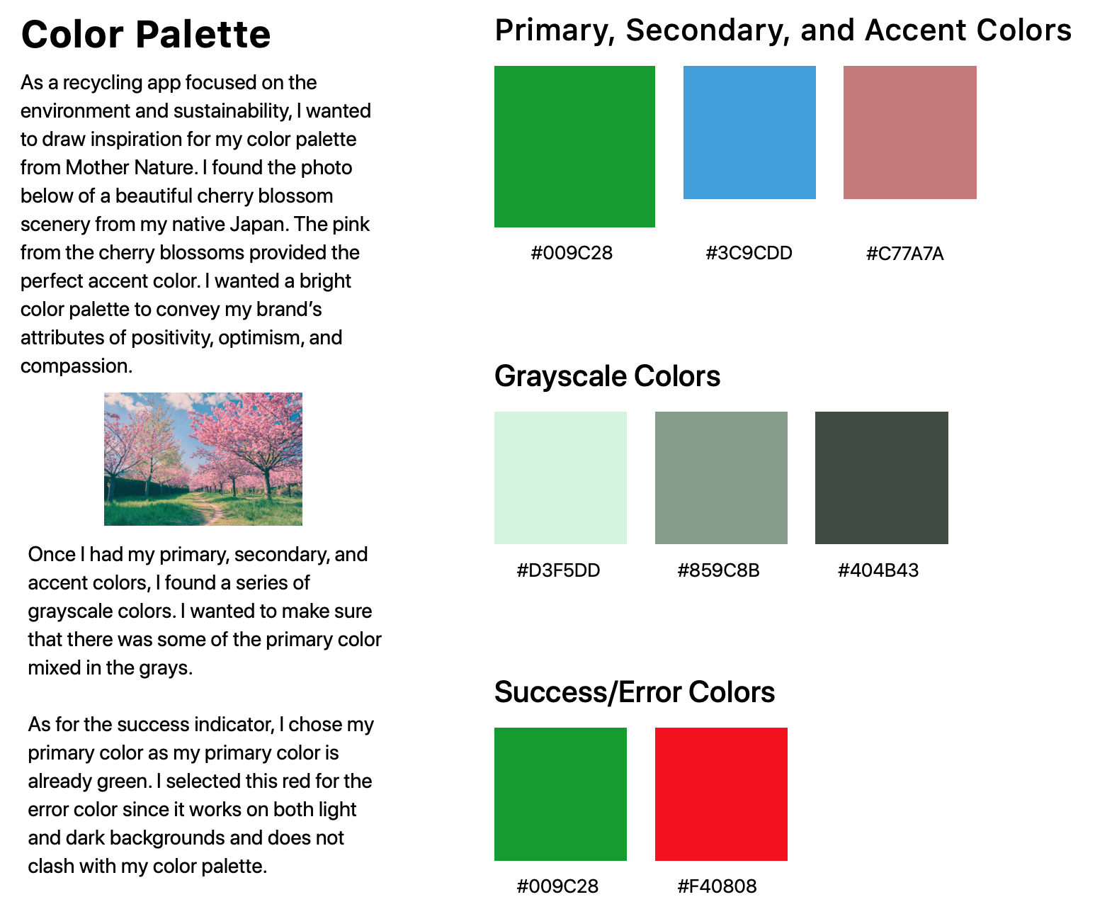
It was critical that the visual design of my app effectively conveyed the brand personality and attributes including positivity and optimism. As a brand, we are persistently hopeful that an individual’s recycling effort can truly make a difference. It was important that the app felt very clean and spacious since the app aims to keep the Earth clean. Additionally, I chose green as the primary color for my app since the brand is working towards a world full of lush, green landscapes like those in Claude Monet’s paintings (hence the app name “Monet).
High Fidelity Designs
Visibility of System Status
It is crucial to communicate clearly to the users that their actions has consequences. The system has successfully registered and processed their action and the system is performing as intended. This progress bar pops up immediately after taking a photo of an item, letting the users know that the system is processing the information to present them with the results.
Additionally, the design should build trust through open and continuous communication about where they are in the system. I made sure that the tab bar always clearly indicated which screen the user was currently on so that they can easily determine their next steps.
Aesthetic and Minimalist Design
As I was designing my screens, I ensured that interfaces did not contain any information that is irrelevant or barely needed by the users. I did not want any unnecessary noise to distract the users from using this product to solve their problems.
Considering the Aesthetic and Minimalist Design heuristic does not mean that my designs are flat and boring or merely sparse. For example, the Your Journal screen has plenty of information and images that fill the screen. However, the content and visual design of this screen focuses on the essentials. It helps the users know what the primary goal of this screen is, which is to see all the item the user has recycled using the app.
Help Users Recognize, Diagnose, and Recover from Errors
I added error state screens with very plain, simple language to let users know precisely what the problem is and furthermore, suggest actionable solutions to resolve this error. Avoiding technical jargon was key as I wanted users to quickly recognize that they were in the error state. Using complicated jargon or error codes would have only confused and further frustrated my users.
For example, when a user loses connectivity due to internet problems, the app will immediately let them know that they have an issue with their connection. Additionally, when a user takes a photo of an item to check if it is recyclable, but the app is unable to properly identify the item, the error state informs them swiftly. Staying consistent with my brand’s positive personality, I kept the language and the supporting visual treatment quite upbeat. Most importantly though, in both error messages examples I offered solutions (multiple solutions in the Results screen) to help users navigate out of this error.
5. Test
Prototype
Upon solidifying the visual design of my app, I created the high-fidelity mockups that were used in my tappable prototype.
With the prototype complete, it was time for me to take it into the real world to see how effective the Monet app could be in helping people build better recycling habits.
Usability Testing
I conducted two rounds of usability testing with 5 participants in each round. These participants were recruited through online networking, social media, and emailing and the tests were conducted remotely using Invision.
I conducted the usability tests to ensure that the concept of the app was easy to understand and to identify any accessibility issues. I went into the usability testing with a set of objectives and key questions/tasks that I wanted to ask.
+ Objective
Check if people can easily understand the concept of a mobile recycling identification tool/tracker.
Identify any accessibility issues
Ensure that the main functions of the app are easy to learn
+ Test Questions/Tasks
Check if an item is recyclable or not
How do users check how many items they have recycled through the app?
Can you identify which new messages you have not read yet?
What do you expect to see when you tap on Sproutlot?
How do you expect to learn more about the items you’ve recycled?
After the first round of testing, there were 3 main issues that were brought to light that I had to address and improve upon.
Issue #1
The impact of the user’s recycling (their recycling metrics) on the main screen was not as eye-catching and prevalent as necessary to provide maximum value.
Participants were a bit confused as to why the images were so much bigger than the recycling metrics. Additionally, several participants stated that the metrics were not presented in a particularly interesting/fun or an effective manner and thus, they needed to do a bit of searching for the numbers. Based on these insights, I made iterations to the main screen to make sure that the key recycling metrics catch the user’s attention so that they truly understand the growing impact of their recycling efforts.
For the second round of testing, I made the supporting images smaller while increasing the size of the figures. Additionally, I made the figures bold and in green so that it pops off the white background and catches the users’ eyes. These changes proved effective as participants in the second round were able to quickly find and understand the key metrics on the screen.
Issue #2
It was unclear how to navigate out of the Floating Action Button screen.
Participants had no problems understanding how the FAB works, but users had trouble figuring out how to exit out of this screen when they did not want to choose any of the three options.
To address this navigational issue, I redesigned the screen so that the primary floating action button changes from “Add” to “Close” when this screen is open. This change proved effective as participants in the second round were able to easily navigate in and out of this screen as they desired.
Issue #3
When users are on the Your Journal screen, they want to know how many items they have recycled.
Your Journal lists each item the user has recycled through the app. Users appreciated the functionality of the journal, but wished there was a way to quickly know how many items were in the journal. Without knowing how many items were in the journal, users were confused about how much they would need to scroll down. Additionally, participants mentioned wanting to know how many of what kind of items were recycled.
Thinking about the visual hierarchy of this screen, I wanted to include a counter at the top of the screen so that users would quickly know how many items were in their recycling journal. Additionally, I placed a drop down feature so that users can filter their journal by item type (i.e. aluminum, plastic, etc.). These changes had the intended effect as participants in the second voiced their appreciation for the counter as it immediately informed them of how much they would need to scroll to reach the last item.
Key Learnings & Take Aways
I started with a simple problem to solve for people like myself and learned about different problems that people were experiencing more broadly. It is always a fascinating and incredibly rewarding experience finding creative solutions through user-based insights. Here are some of the key takeaways I learned from this end-to-end UI/UX project:
It is always important to know who you are designing the product for and be empathetic to their struggles and frustrations. Empathy maps and persons play vital roles in understanding user behavior and needs so that I can keep the users top of mind at all times.
When it comes to conducting usability tests, you can gain an incredible wealth of insights from not only listening to your participants, but also observing even their subtlest behaviors and actions. Often participants in usability tests will kindly say things they believe you want to hear, but their actions do not lie.
“Design is never done.” Even after validating my design solutions through usability testing, there are always more insights I would like to learn about my users, improvements to make upon my designs, and solutions to explore.

